From scatterplot to heatmap
- point plot
- jitter plot
- self made jitter plot
- heatmap raster
- hexagon plot
- contour plot
- smooth density
- plot wind classes
- more examples
A scatterplot is a good tool for visualizing patterns in a dataset without any prior knowledge about the dataset. It shows all it’s structure in a very raw, unbiased format. But if you have lots of data points you get intense overplotting: new data points are plotted over already existing data points essentially hiding what is beneath them. Hence you get a plot with solid color and no structure visible at all. That’s the point where it is better to plot a heatmap of point density instead. This is what I will be showing in this post.
We will be using the following packages:
library(lubridate)
library(dplyr)
library(readr)
library(stringr)
library(ggplot2)
library(patchwork)
library(knitr)
Let’s get and read some example data. We will be working with wind data:
data_dir = "data/dwd/Cottbus"
dir.create(data_dir)
url <- "https://opendata.dwd.de/climate_environment/CDC/observations_germany/climate/hourly/wind/historical/stundenwerte_FF_00880_19830101_20231231_hist.zip"
destfile = file.path(data_dir, basename(url))
if(!file.exists(destfile)){
  download.file(url, destfile)
  unzip(destfile, exdir = data_dir)
}
wind_data <- read_delim("data/dwd/Cottbus/produkt_ff_stunde_19830101_20231231_00880.txt", delim = ";", na = "-999", trim_ws = T) %>%
mutate(MESS_DATUM = as.POSIXct(as.character(MESS_DATUM), format="%Y%m%d%H")) %>%
mutate(yday = yday(MESS_DATUM)) %>%
rename(speed=F, direction=D) %>%
mutate(direction = if_else(direction> 360, NA, direction)) %>%
na.omit()point plot
A point plot or scatterplot always gives the first glimpse into the data. It reveals information about the distribution of the data and shows any structure in the distribution of the data. In this case it tells us more about the measurement and data logging device than about the measured quantity itself:
early <- wind_data %>%
  filter(speed > 0) %>%
  filter(MESS_DATUM < "1991-02-12") %>%
  ggplot() +
  aes(x=direction, y=speed) +
  geom_point(size=0.1) +
  ggtitle("data before 1991-02-12")

later <- wind_data %>%
  filter(speed > 0) %>%
  filter(MESS_DATUM >= "1991-02-12") %>%
  ggplot() +
  aes(x=direction, y=speed) +
  geom_point(size=0.1) +
  ggtitle("data after 1991-02-12")

early/later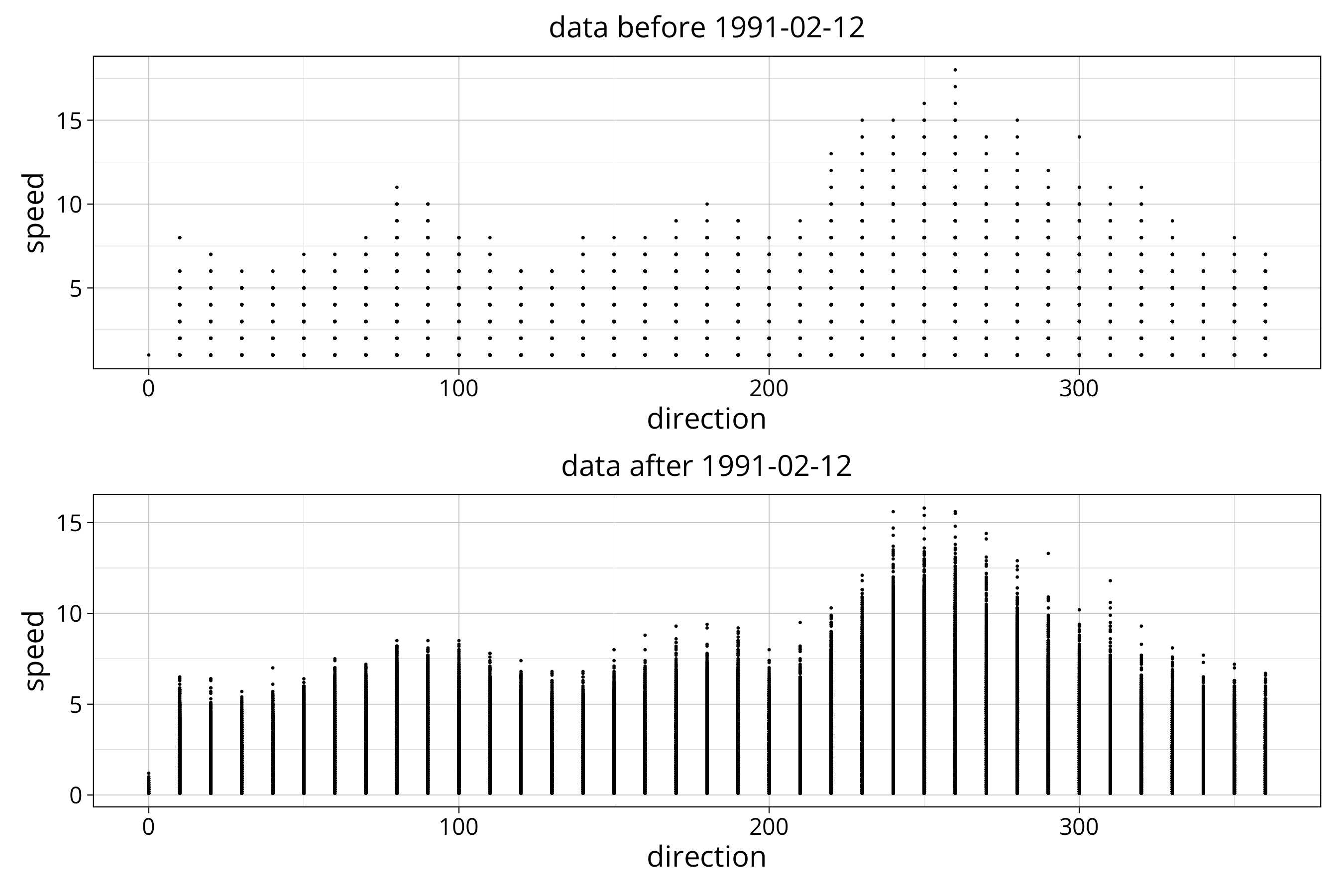
We can see that the data is not scattered enough to get an idea about the data distribution. Instead we see that the wind direction is stored in 10 degree intervals. The wind speed was stored in 1 m/s intervals before 1991 and is stored with 0.1 m/s resolution after that. Here is how to find that resolution:
speed_resolution_early <- wind_data$speed[wind_data$MESS_DATUM < "1991-02-12"] %>% unique %>% sort %>% diff %>% min
speed_resolution_later <- wind_data$speed[wind_data$MESS_DATUM >= "1991-02-12"] %>% unique %>% sort %>% diff %>% min
direction_resolution <- wind_data$direction %>% unique %>% sort %>% diff %>% min
With unique and sort we extract all unique values and order them in increasing order. With diff we calculate the difference between those sorted values. The minimum of that is the measurement resolution.
In the metadata file (“Metadaten_Geraete_Windgeschwindigkeit_00880.html”) we can confirm that at this location the device to measure wind speed and direction changed several times. One of those changes was on February 12th of 1991 where obviously the resolution was increased.
jitter plot
Right now we have lots of data points plotted on top of each other in a few locations. They lie in an artificial grid created by the measurement resolution (or storage resolution) of the device. We have good reasons to believe that wind doesn’t blow in 1 or 0.1 m/s speed increments or 10 degree directional increments. Therefore we assume that the real wind speed is somewhere around the stored values.
In the plot we can account for that by adding noise to the data. This is done in a convenient way by the geom_jitter plot:
early <- wind_data %>%
  filter(speed > 0) %>%
  filter(MESS_DATUM < "1991-02-12") %>%
  ggplot() +
  aes(x=direction, y=speed) +
  geom_jitter(size=0.1, alpha=.1) +
  ggtitle("data before 1991-02-12")

later <- wind_data %>%
  filter(speed > 0) %>%
  filter(MESS_DATUM >= "1991-02-12") %>%
  ggplot() +
  aes(x=direction, y=speed) +
  geom_jitter(size=0.1, alpha=0.01) +
  ggtitle("data after 1991-02-12")

early/later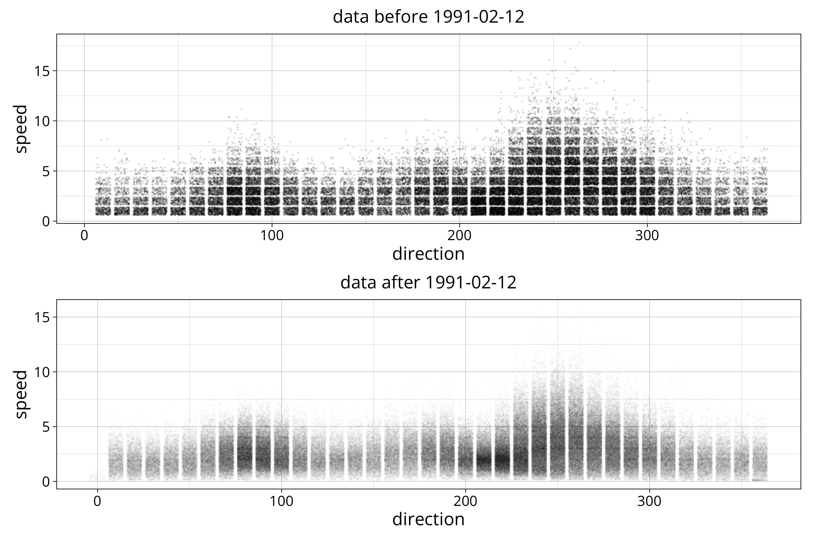
Per default it randomly spreads the data by 80% of the data resolution. Width and height of the spread can be set to any amount. In our case it would make sense to give it the resultions we calculated earlier: width=direction_resolution, height=speed_resolution_later. But we will be doing it in our own version of the geom_jitter plot as described in the following.
self made jitter plot
Since we will be doing other plots with the data we construct our own jitter plot creating two new data variables with noise added:
wind_data <- wind_data %>%
  filter(speed>0) %>%
  mutate(direction_jitter = (direction + runif(n(), -direction_resolution/2, direction_resolution/2)) %% 360) %>%
  mutate(speed_jitter = if_else(MESS_DATUM >= "1991-02-12", speed + runif(n(), 0, speed_resolution_later), speed + runif(n(), 0, speed_resolution_early)))
For the direction we add uniform noise between half the resolution before and after the stored data point. This way we spread data in both directions. We then calculate the modulo of 360 to wrap around values that get pushed below 0 and above 360 degrees. This keeps values in the interval 0 to 360.
For the wind speed we have a lower limit of 0. Therefore we choose to spread values to the top and not the bottom. Hence we add noise between 0 and the measurement resolution. Since the resolution changes in 1991-02-12, we have an if_else clause do deal with that.
In general we filter out wind speeds of 0 because for those the wind direction is sort of undefined. Sure the device will measure something, but this will be the direction of the last wind gust and does not really make sense.
We then construct our own scatterplot. We will be adding a custom axis that shows wind direction like on a wind rose.
windrose <- tribble(
  ~degree, ~symbol,
  0, "N",
  45, "NE",
  90, "E",
  135, "SE",
  180, "S",
  225, "SW",
  270, "W",
  315, "NW",
  360, "N")
wind_data %>%
ggplot() +
aes(x=direction_jitter, y=speed_jitter) +
geom_point(size=0.1, alpha=0.01) +
scale_x_continuous(breaks = windrose$degree, labels = windrose$symbol)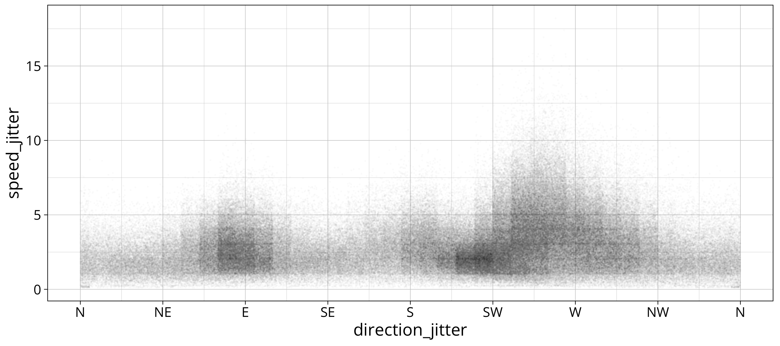
You can see that the plot is kind of boxy. This is due to the fact that we assumed data to be uniformly distributed in the interval. This is an assumption that is certainly not true. But it should be fine for just getting a rough idea about the data distribution. A more advanced way would be to interpolate the density.
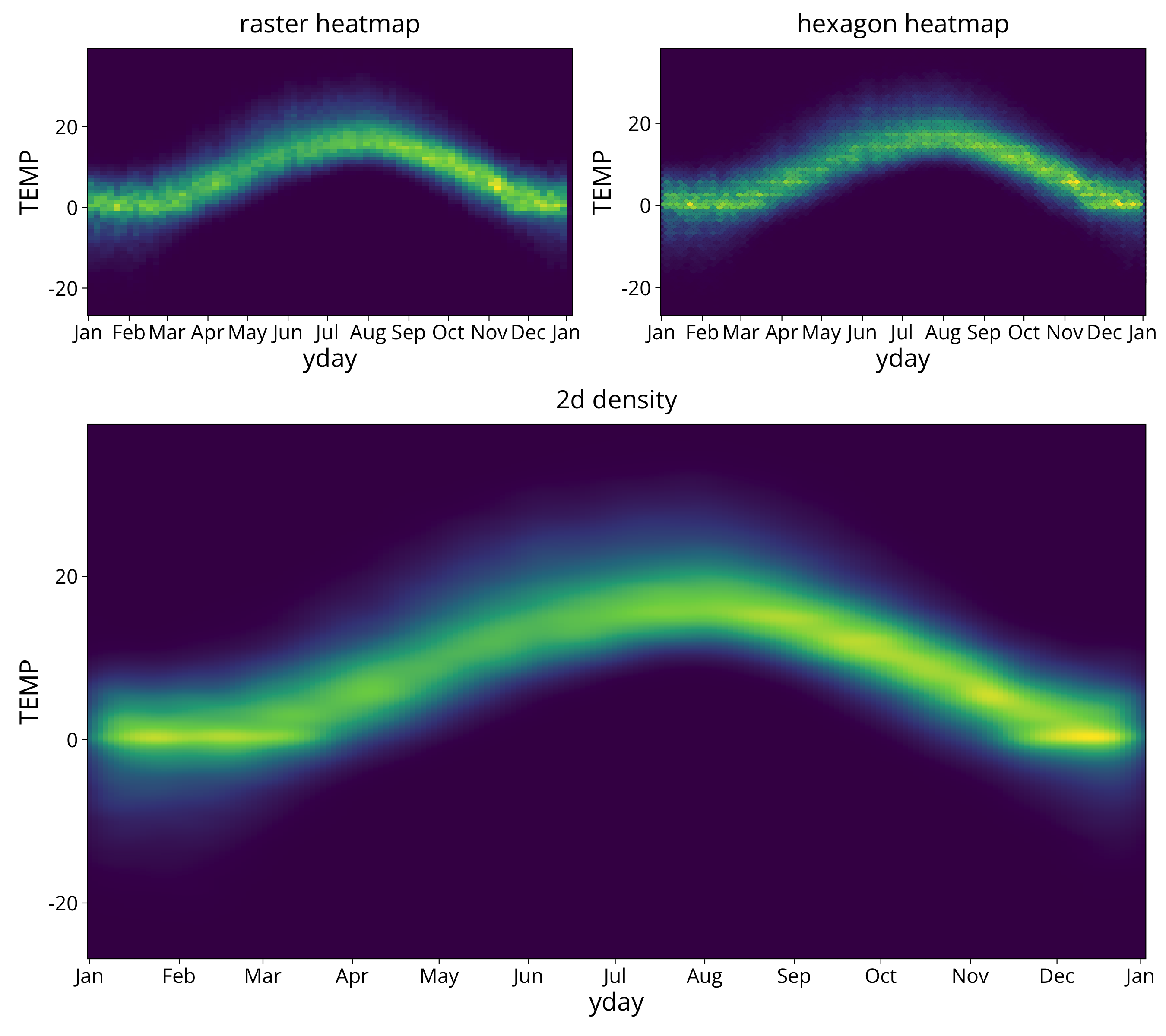
heatmap raster
We used small point sizes and a low alpha to try to avoid overplotting in the scatterplot. But with huge data sets even that is not enough. Also we want to get an idea about the actual density of the data points. This is where it makes sense to switch to a heatmap plot.
A heatmap plot of datapoint densities can be done with the geom_bin_2d function:
aa <- wind_data %>%
ggplot() +
aes(x=direction_jitter, y=speed_jitter) +
geom_bin_2d(binwidth=c(10, .5), show.legend=T, drop=T) +
scale_x_continuous(breaks = windrose$degree, labels = windrose$symbol, expand = c(0,0)) +
scale_y_continuous(expand = c(0,0)) +
scale_fill_viridis_c() +
theme(panel.background =element_rect(fill = "#440D54"), panel.grid = element_blank(), panel.grid.major = element_blank(), panel.grid.minor = element_blank()) +
ggtitle("linear color scale")
bb <- aa +
scale_fill_viridis_c(trans="log10") +
ggtitle("log color scale shows more of the low densities")
aa/bb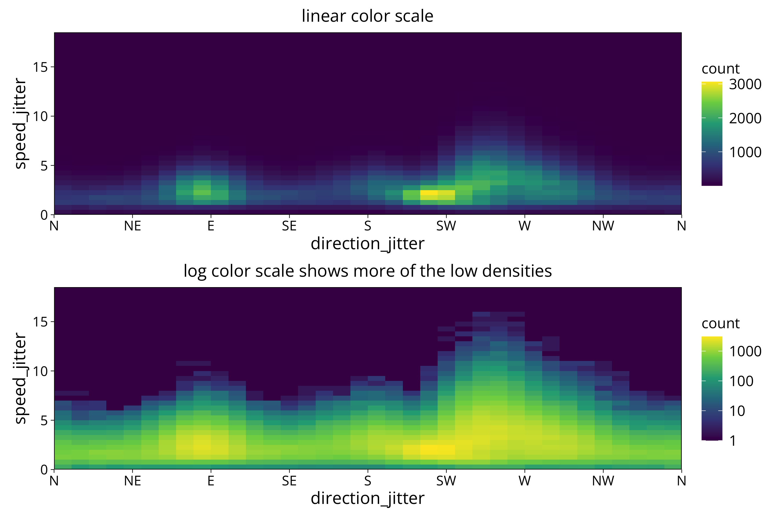 We give it the bin width or number of bins we want to see in the plot. The function then calculates the number of data points in each bin and colors the raster cell by that count. Since we use bin widths smaller than the measurement resolution we use the jittered data here.
Of course, if we use the resolution of wind speed and direction as our bin width we can use the original wind speed and direction as input:
aa <- wind_data %>%
ggplot() +
aes(x=direction, y=speed) +
geom_bin_2d(binwidth=c(direction_resolution, speed_resolution_early), show.legend=T, drop=T) +
scale_x_continuous(breaks = windrose$degree, labels = windrose$symbol, expand = c(0,0)) +
scale_y_continuous(expand = c(0,0)) +
scale_fill_viridis_c() +
theme(panel.background =element_rect(fill = "#440D54"), panel.grid = element_blank(), panel.grid.major = element_blank(),
panel.grid.minor = element_blank()) +
ggtitle("linear color scale")
bb <- aa +
scale_fill_viridis_c(trans="log10") +
ggtitle("log color scale")
aa/bb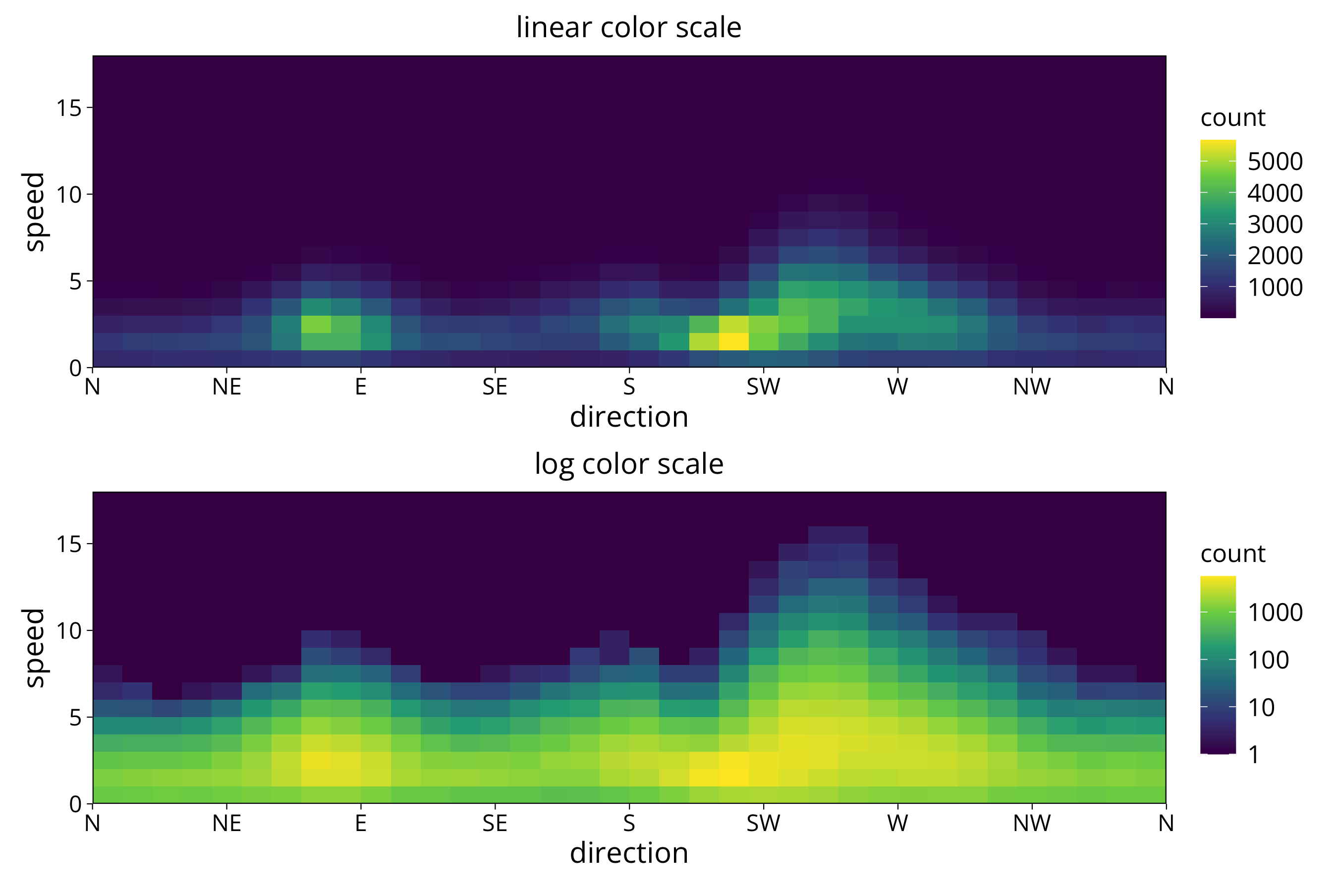 We have to avoid using bin widths lower than the data resolution or at non-integer multiples of the resolution. Otherwise we get aliasing effects in the plot:
wind_data %>%
  ggplot() +
  aes(x=direction, y=speed) +
  geom_bin_2d(binwidth=c(8, .3), show.legend=T, drop=T) +
  scale_x_continuous(breaks = windrose$degree, labels = windrose$symbol, expand = c(0,0)) +
  scale_y_continuous(expand = c(0,0)) +
  scale_fill_viridis_c(trans="log10") +
  theme(panel.background =element_rect(fill = "#440D54"), panel.grid = element_blank(), panel.grid.major = element_blank(),
    panel.grid.minor = element_blank()) +
  ggtitle("aliasing caused by bin widths not aligned with data resolution")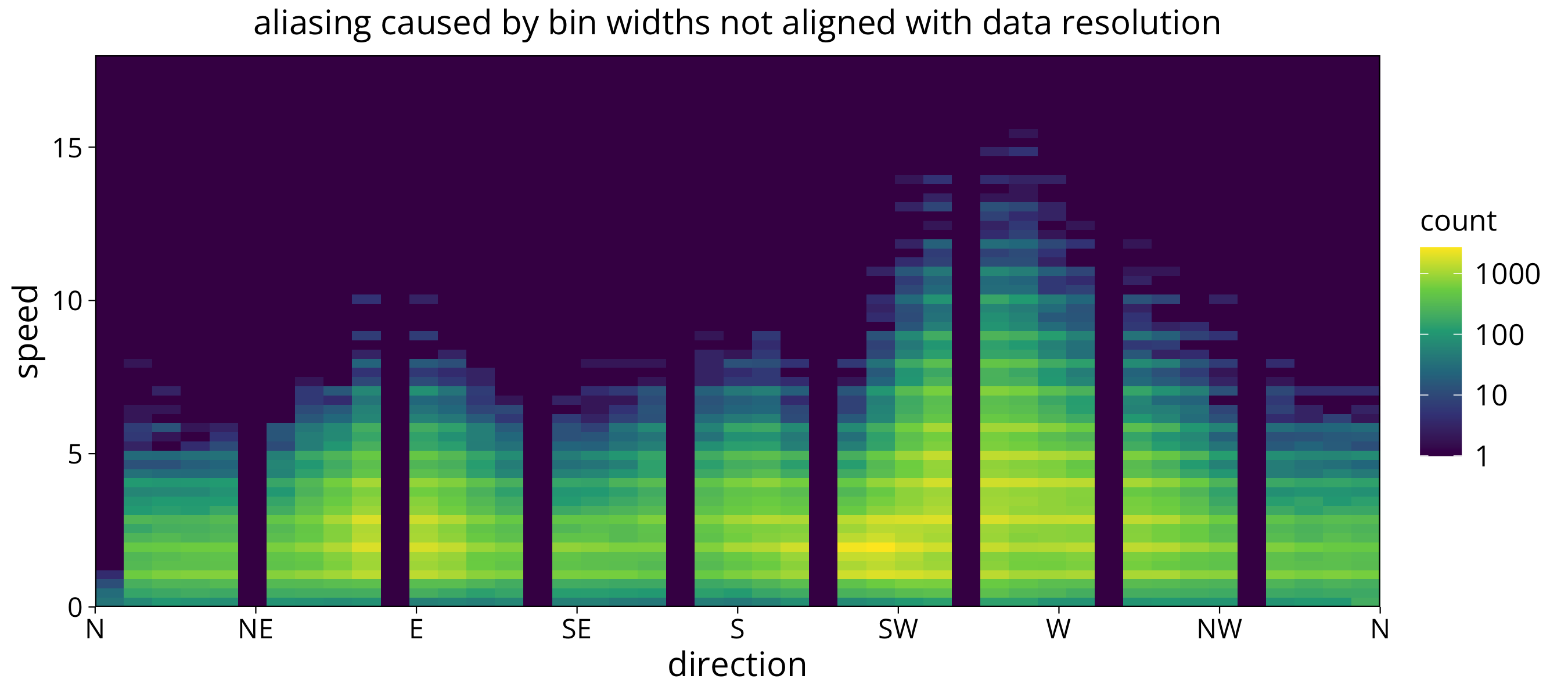
hexagon plot
Another way of making a heatmap plot is using a hexagon plot. Here the data space is devided into hexagons and densities calculated for those.
aa <- wind_data %>%
ggplot() +
aes(x=direction_jitter, y=speed_jitter) +
geom_hex(binwidth=c(5, .7)) +
scale_x_continuous(breaks = windrose$degree, labels = windrose$symbol, expand = c(0,0)) +
scale_y_continuous(expand = c(0,0)) +
scale_fill_viridis_c() +
theme(panel.background =element_rect(fill = "#440D54"), panel.grid = element_blank(), panel.grid.major = element_blank(),
panel.grid.minor = element_blank()) +
ggtitle("linear color scale")
bb <- aa +
scale_fill_viridis_c(trans="log10") +
ggtitle("log color scale")
aa/bb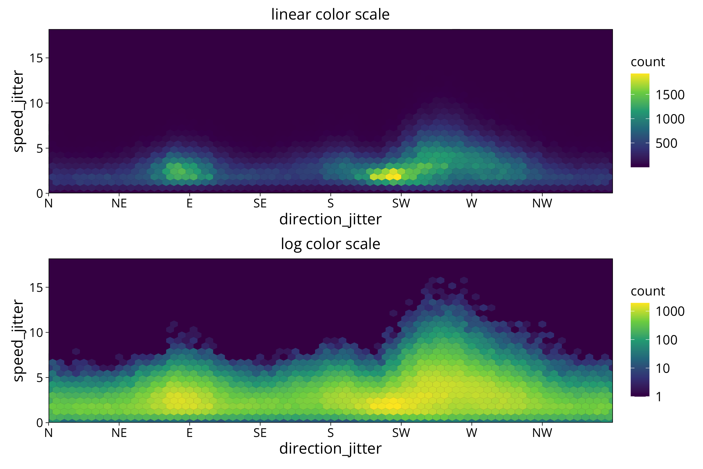 The hexagon plot is more directionally unbiased. It makes it easier to spot patterns that don’t follow the x or y direction.
Note: geom_hex has no drop option. As a workaround set Background to #440D54 (which is the darkest color of the viridis palette).
contour plot
To totally free ourself from the x and y directions of the data storage we can use a countour plot. For this plot data densities get interpolated between the different areas. This gives us round contour lines.
wind_data %>%
  ggplot() +
  aes(x=direction_jitter, y=speed_jitter) +
  geom_density_2d_filled(binwidth=50, contour_var = "count") +
  scale_x_continuous(breaks = windrose$degree, labels = windrose$symbol, expand = c(0,0)) +
  scale_y_continuous(expand = c(0,0)) +
  scale_color_viridis_d() +
  theme(panel.background =element_rect(fill = "#440D54"), panel.grid = element_blank(), panel.grid.major = element_blank(),
    panel.grid.minor = element_blank())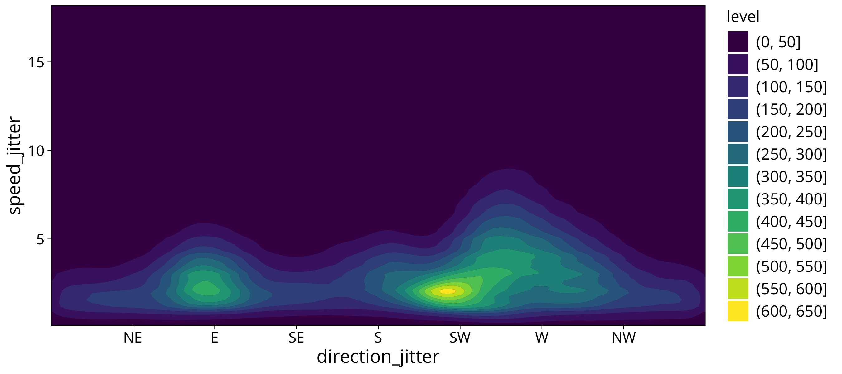
What does not work well with the contour plot is that we have a periodic data variable. The wind direction should countinuously wrap around. But the countour lines found by the algorithm don’t reflect that.
But apart from that this plot gives us a very clear picture: We have two main wind directions in th 2.5 m/s range. The main direction is SW, the other is E. We also see that winds above 5 m/s mainly come from a wind direction between SW and W. So the strong winds come from a bit more of a western direction than the majority of the lower wind speeds.
I would say that this way of plotting the data at hand gives us the most clear answers about the dataset.
smooth density
The countour plot can be done in a way that the countours disappear into a smooth density distribution.
wind_data %>%
  ggplot() +
  aes(x=direction_jitter, y=speed_jitter) +
  stat_density_2d(
      geom = "raster",
      n = c(200, 200),
      aes(fill = after_stat(count)),
      contour = FALSE,
      show.legend = T
  ) +
  scale_x_continuous(breaks = windrose$degree, labels = windrose$symbol, expand = c(0,0)) +
  scale_y_continuous(expand = c(0,0)) +
scale_fill_viridis_c() 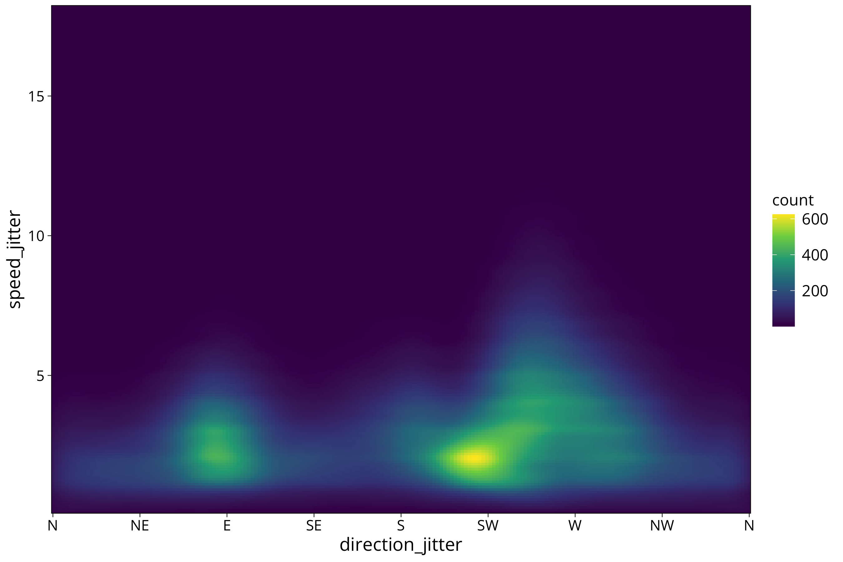
We still see some of the remnants of the boxy data distribution that we created by adding the jitter. Which in turn is remnant of the coarse measurement/storage resolution of the recording device.
The stat_density_2d function works by smoothing the datapoints with a Gauss filter. The bandwidth of the filter (sigma) can be influenced with the h = option:
wind_data %>%
  ggplot() +
  aes(x=direction_jitter, y=speed_jitter) +
  stat_density_2d(
      geom = "raster",
      n = c(200, 200),
      h = c(1,.2),
      aes(fill = after_stat(count)),
      contour = FALSE,
      show.legend = T
  ) +
  scale_x_continuous(breaks = windrose$degree, labels = windrose$symbol, expand = c(0,0)) +
  scale_y_continuous(expand = c(0,0)) +
scale_fill_viridis_c() 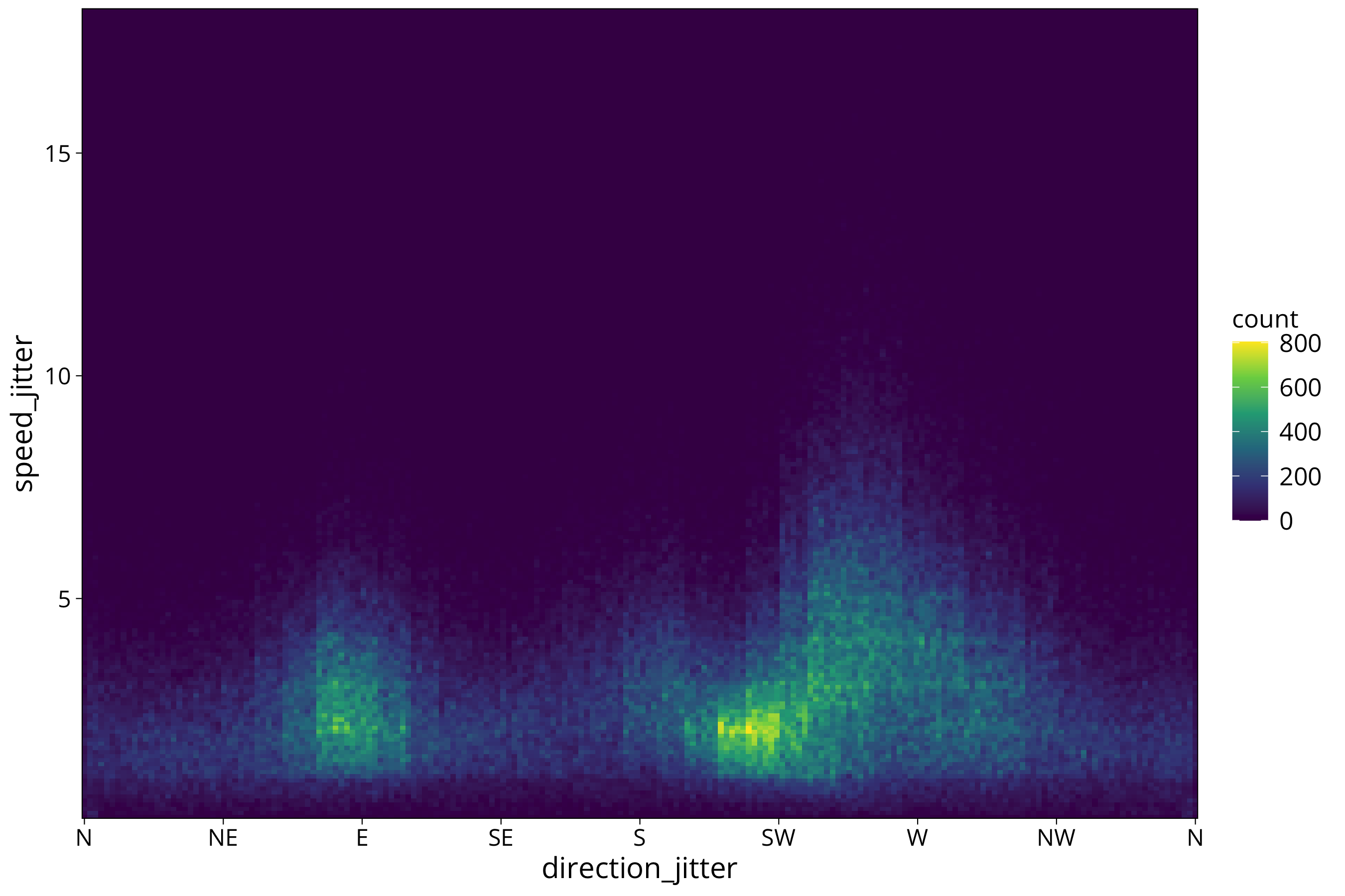
plot wind classes
More resolution is not always better. We might want to plot more of a summary statistics plot that highlights the dominant wind directions and mean wind speeds. For that we can give our heatmap very coarse resolution.
For this we can construct our own density calculation by cutting the data space into defined intervals with the cut function. We then use summarise to calculate the number of measurements in all the intervals:
wind_data %>%
  mutate(direction_jitter = if_else(direction_jitter<=45/2, direction_jitter+360, direction_jitter)) %>%
  group_by(direction_bin = cut(direction_jitter, breaks=(windrose$degree+45/2), right = FALSE, include.lowest = TRUE),
           speed_bin = cut(speed_jitter, breaks = 0:ceiling(max(direction_jitter)), right = FALSE, include.lowest = TRUE)) %>%
  summarise(count = n()) %>%
  ggplot() +
  aes(x=direction_bin, speed_bin, fill=count) +
  geom_raster(col=NA) +
  scale_x_discrete(labels = windrose$symbol[-1], expand = c(0,0)) +
  scale_y_discrete(expand = c(0,0)) +
  scale_fill_viridis_c() +
  theme(panel.background =element_rect(fill = "#440D54"), panel.grid = element_blank(), panel.grid.major = element_blank(),
    panel.grid.minor = element_blank())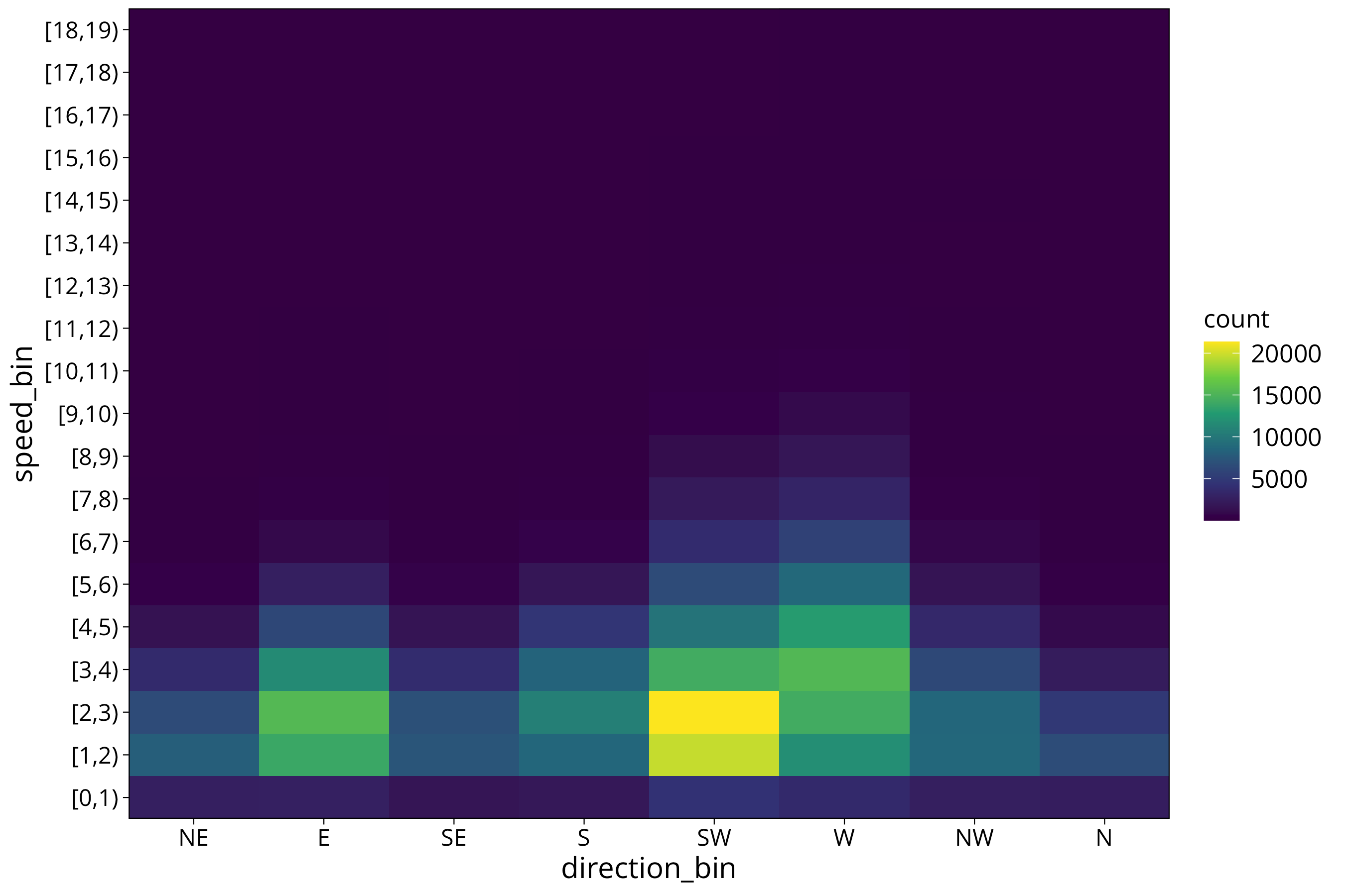
Unfortunately the device resolution of 10 degrees does not allow to devide the display into the 8 wind directions. So again we need to use the jittered data to avoid aliasing.
more examples
air temperature
In this plot we can see that a lot of measured temperatures in winter are around the threshold of 0°C. This is the point where further cooling is buffered by water freezing. The phase change of the water releases heat that keeps temperatures at zero degrees. An effect that is used by fruit farmers in the spring: If blossoms are threatened to be destroyed by freezing temperatures they spray the trees with water. That prevents temperatures to drop below zero and protects the blossoms.
solar radiation
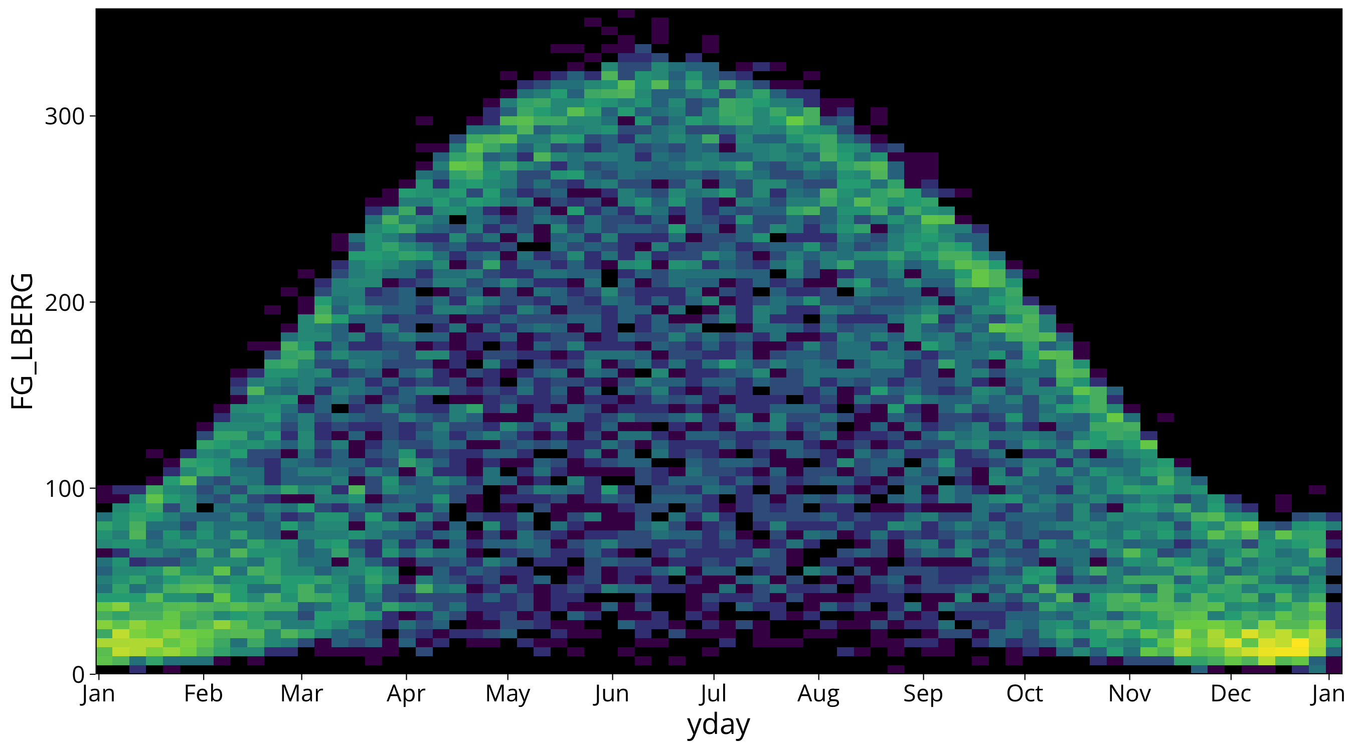
The next graph shows the density of radiation measurements at solar noon over the course of the year with data from 1980 to today.
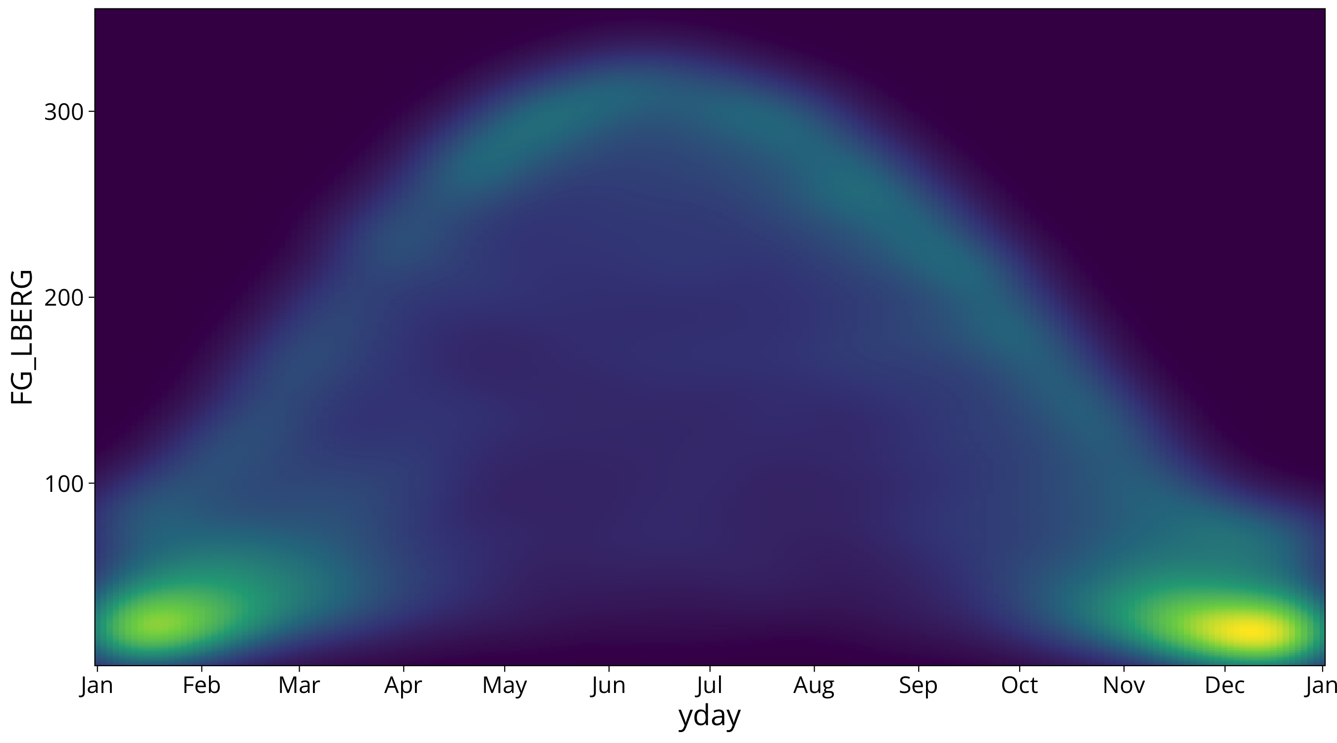
Here you see that the Gauss filter also blurs the sharp eddges where radiation reaches its maximum. This can be an unwanted effect since it is a real physical maximum set by the maximum radiation at clear sky. It still shows how there is higher density of measurements close to the maximum than in the lower regions.